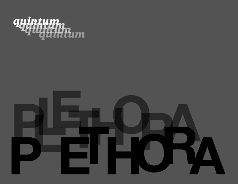
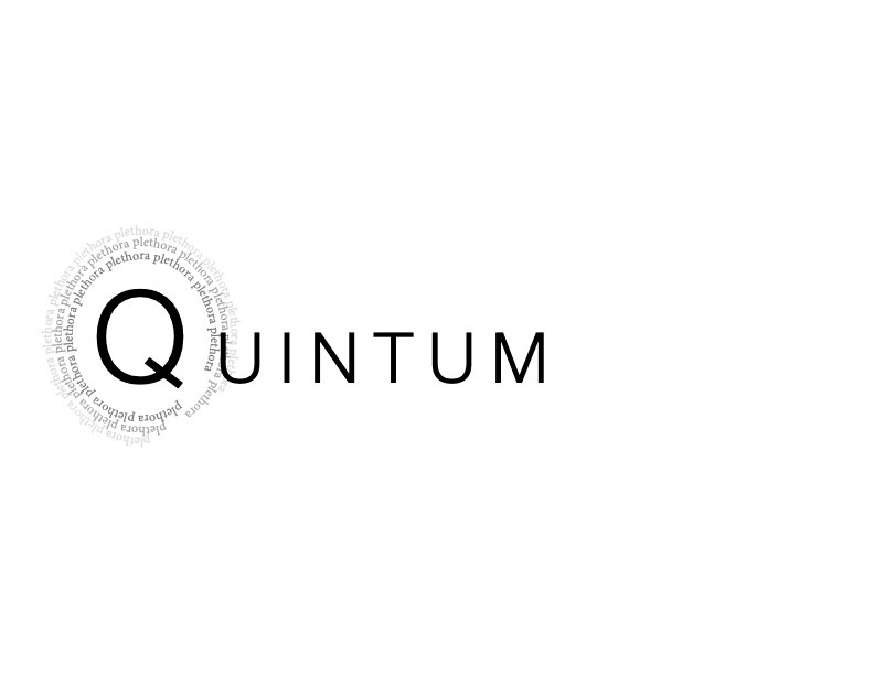
Text exercise. Creating interesting compositions with only two words, varying font size and opacity and placement to catch viewer's attention.
Informational page spread for school assignment. Target audience: Those interested in industrial design, adult. Colours and fonts inspired by 1930s aesthetics, the time period in which the subject took place.
Poster done for client. Goal being to advertise their event, target audience teen and young adult, mainly males. Gathered a feel for the client's aesthetic and used it to make an eye-catching design.
(right) infographic, achieved the goal of being helpful and easy to read by using contrasting colours, simple image examples, and quickly summarized explanations next to each point.
Tutorial created for my own brand, to help aspiring artists. Used a mix of visuals and text to make the point as easy to understand as possible.
Created intro video with my own logo for my brand.
Pieces done for school projects. (right) goal is to create infographic on subject, composition inspired by their time period as well as the idea of a diary, choosing fonts and colouring to reflect this. (left) goal was to create a simple poster highlighting a mental health issue.
Billboard poster done for school project. Goal was to be eye catching with a clear message. Used photoshop to create an image that reflected the message as well, using low saturation and little colour, just enough to emphasize parts of the composition.
Design for a can of iced tea. Started with lots of brainstorming and researching designs similar to what I wanted the design to be. Goal was to create a relaxing night-time drink for young adults.
Animated advertisement for the web, created a gold-like texture for the text, because the client's brand name means 'gold' in latin.
Business cards for myself. Target audience: a variety, mainly young adults. Simple but with personality.
